Pages
▼
Friday, April 30, 2010
John Fowler & Nancy Lancaster
Fowler London bedroom from 1970's, image from Architectural Digest
John Fowler worked with and was inspired by and inspired Nancy Lancaster for many years. He began as an apprentice in a workroom that painted screens and fabric. He joined Sibyl Colefax's interior design firm in 1938. But it was his collaboration with Nancy Lancaster that really put him on the map. Together they made famous the English Country look (which wasn't really invented by a decorator, it just evolved in English country houses). It is the beautiful but slightly shabby look featuring lots of chintz and antiques handed down through families. Nancy Lancaster and John Fowler perfected this look. Over time Fowler's style became less shabby and more refined and fussy (especially the elaborate curtains he favored).
Some of his rooms:
Fowler's London drawing room for the Bruces, 1960's, image from Architectural Digest
Bruce family London drawing room by John Fowler
Another Fowler drawing room from the 1960's - Wingfield House, from Aesthetes Lament blog
Parisian drawing room, image from A Different Shade of Gray blog
Washington, DC drawing room of the Bruce family in 1970's, image from Architectural Digest, via Aesthete's Lament
Same DC room, close up of chairs that were in Nancy Lancaster's bedroom at Haseley Court, Architectural Digest, via Aesthete's Lament
Thursday, April 29, 2010
Creating order out of chaos
image from India Hicks
Today we are headed to a client's house to get started on making the house beautiful. We are going from something like this
image from ocsitcom blog
to this
image from Schuyler Samperton
Hopefully!!!
Wednesday, April 28, 2010
Recipe for a successful, comfortable room
Sitting room at Haseley Court, image from little augury
Nancy Lancaster thought rooms should look undecorated, aged and furnished over time. We agree with her. Here is her list of things that are important for a "comfortable environment," from The Great Lady Decorators:
"1. In restoring a house, one must first realize its period, feel its personality, and try to bring out its good points;
2. Decorating must be appropriate;
3. Scale is of prime importance, and I think that oversized scale is better than undersized scale;
4. In choosing a color, one must remember that it changes in different aspects;
5. Understatement is extremely important, and crossing too many t's and dotting too many i's makes a room look overdone and tiresome. One should create something that fires the imagination without overemphasis;
6. I never think that sticking slavishly to one period is successful; a touch of nostalgia adds charm. One needs light and shade, because if every piece is perfect, the room becomes a museum and is lifeless;
7. A gentle mixture of furniture expresses life and continuity, but it must be a delicious mixture that flows and mixes well. It is a bit like mixing a salad. I am better at rooms than salads.
To these guidelines Nancy always added her magic ingredients; open fires, candle light, and masses of fresh flowers."
image from live like you blog
Her famous yellow room above is filled with beautiful furniture and things and yet don't you just want to kick off your shoes and curl up in a chair? Comfortable, beautiful rooms have form and function working together hand in hand.
Charleston designer Amelia Handegan's rooms have that same feel to them.
the other side of that room above -
image from Southern Accents
I adore this Alessandra Branca room! Look at all of the fresh flowers.
image from elle decor
This Branca room conveys vibrant warmth and beauty.
image from Southern Accents
Branca understands what Nancy Lancaster was describing above - she says: "For me it's not enough that a room look good. It also has to work. I put an incredible amount of effort into making people feel comfortable." from New Classics Interiors by Alessandra Branca
Tuesday, April 27, 2010
Nancy Lancaster's Mirador
I have been pouring over the photographs and devouring the words of the The Great Lady Decorators by Adam Lewis. Most of their stories have been told before (some many times), but it's nice to have all of them in one pretty place.
I loved reading the chapter on stylemaker Nancy Lancaster - she is legendary in Charlottesville, Virginia, which is where I went to college. Her family's house, Mirador, is just outside of Charlottesville. If you've ever driven by the house, you know it's something special. The house was bought by Nancy's grandfather Chiswell Langhorne after he rebuilt his fortune after the Civil War. It was then owned by various family members and was subsequently bought by Nancy and her husband Ronald Tree. It is still privately owned (the Trees sold it in the fifties, when they lived in England).
image from HMBD.org
above images from dhr.virginia.gov
Besides the beauty of the house itself, the house is special because three fascinating ladies lived here at some point. All of the Langhorne family (Nancy Lancaster's mother's family) - they are: Nancy Astor, Irene Gibson, and of course Nancy Lancaster.
Nancy Astor, painted by John Singer Sargeant
Nancy Langhorne Astor was born in Danville, Virginia and was the daughter of Chiswell Dabney Langhorne and Nancy Keene. She lived at Mirador in her late teens. She married Waldorf Astor, Second Viscount Astor and lived in England. She was the first woman to sit as a Member of Parliament in the British House of Commons.
Irene Langhorne Gibson, wife of Gibson Girl artist Charles Dana Gibson
Irene Langhorne Gibson was Nancy Astor's sister. She married Charles Dana Gibson in 1895 and was one of the primary muses for his Gibson Girls.
Gibson Girls by Charles Dana Gibson
Nancy Lancaster
Nancy Lancaster was the niece of the above two ladies. Her mother was Elizabeth Perkins, eldest daughter of Chiswell and Nancy Langhorne. Nancy grew up in Richmond, Virginia and New York. Her fondest childhood memories were while visiting her family at Mirador. She married three times, and it was during her second marriage to Ronald Tree that she bought Mirador from her aunt Phyllis. She bought the house in 1922 and sold it in 1950 when she was living in England. Nancy lived in England for most of her adult life and was considered to be quite a tastemaker in England in the first half of the twentieth century. She owned the interior decorating firm Colefax Fowler.
Nancy Lancaster's famous yellow room
Nancy Lancaster's Gothic bedroom at Haseley Court - image via Peak of Chic
There is more great information over at Little Augury.
Monday, April 26, 2010
Bienvenue!
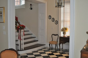
My entrance hall at Christmas last year.
image from Home Interior Design Themes
image from Room Remix blog
Welcome! That's what an entrance hall says to the visitor. Ideally, an entrance hall also tells the visitor something about the homeowner and sets the tone for the rest of the house. It is a great place to make a design statement in your house. It's a good idea to have a table or console to put things like keys and gloves when you first enter. And a chair and an umbrella stand are nice additions too. A settee look great under the stairs.
I love this sofa covered with a suzani (For beautiful suzanis go here). It sits so nicely under the stairs.
image from Decor Arts Now
image from decor pad
image from CSN lighting
The entrance hall at Mirador, Nancy Lancaster's house in Virginia
No one does an entrance hall better than Miles Redd. Three of his front halls -
Architectural detail is also important. If there's not much detail, then a bold paint color will do the trick.
John Pierce Mansion, Portsmouth, New Hampshire entrance hall
Here is the hall reproduced in miniature!
Miles Redd
image from House of Beauty and Culture
image from Elle Decor
A front hall is a great place to showcase art.
image courtesy of Whitehaven
Close up - the drawing on the right is by Atlanta artist Helen Durant.
Jane Douglas' front hall. The shot of orange at the end is fabulous!
Above photo, my own entrance hall as seen from the living room.