Right, my house portrait by Kelly Robson, 2010
How many times in life do you get to do something over? How many times do you wish you could have done it better? Well, we were lucky to get to perfect our Richmond rowhouse renovation here in Atlanta when we built our "new old house" in 2007. I thought it would be interesting to compare the two houses and see how the first led us to the second. And I think there are some universal lessons to be learned for all renovators/new builders. Such as how to get the most out of your project - we did that both times - on very different budgets. While our budget on the Atlanta house was more generous than that of the Richmond house - we still had a firm budget. We were able to build this house for $180 a square foot, including architect's fees. When we were building, many folks in the housing industry told me I couldn't build a custom, attractive, detailed house for under $200 a square foot - I did.
In looking at the pictures of both houses I am struck by the many similarities - but of course they were chosen by the same two people. I am surprised that our style has remained so much the same (we just have a lot more inherited furniture now and more money to spend on finishing a house). Even though the Richmond house was largely undecorated, it has a similar feel to the Atlanta house - which is very finished (well, I don't think it's finished but my DH definitely does!)
Both houses are row house style with three windows over two, side door and stacked room layout, with a side hall. The entry of a house is important - it makes a statement about the house and its style. Picking the front doors of both houses was important to us. I like to have a covered area where a visitor can get out of the rain.
Richmond

Atlanta

Stairs as seen from the front door, Richmond

Atlanta (my favorite picture of the stairs, as seen at Christmas)

Standing in the stair hall of both houses looking back at the front doors.


Living room, Richmond

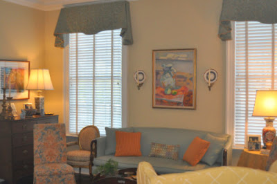
Living room March 2008 (right after we moved in, it looks different now, but I like the light in this photo), Atlanta

Living room, Feb 2010, Atlanta


Of course it's changed again (decorator's prerogative to change a room every two months!) But I don't have photos yet.
Dining room, Richmond

Dining room, Atlanta, Fall 2009

Dining room Atlanta, set for a dinner party

Keeping room, Richmond

Family room, Atlanta


Master bath, Richmond

Master bath, Atlanta


Kitchen, Richmond

Kitchen, Atlanta


I think the most important thing to think about when you begin a big renovation or new build is what your priorities are. For example, formal, pretty rooms are something my husband and I both like - so we spent money on the architectural elements, furnishings and window treatments in the living and dining rooms. The kitchen is important to me, and I know exactly what I like - white cabinets, dark counter tops, traditional cabinetry, hard wood floors. Bathrooms are not that high on my priority list. I have a sort of old fashioned idea that they are just utilitarian. My children's bathrooms are functional and pretty, but not fancy. My master bath is trying to look old, and there is no marble (that saved a lot). We were committed to trying to have the Atlanta house look old and so we followed our architect's recommendation that we not have any can lights on the main two levels - and I got to pick out a lot of fun light fixtures. These are very personal decisions and not every one would make these their priorities. The lesson here is that if you figure out what you, the homeowner, want before you begin, and you figure out how you will live in your house, your project will make you much happier in the end. By doing a very similar project twice, we got to refine and perfect in Atlanta what we began in Richmond.
Fun light fixtures we picked out because there are no cans on the main two levels:
A pineapple in my office area

Lights in my kitchen and breakfast room in the background

Upstairs hall, still no can lights

The last part of this series, Part IV, will be some history of Church Hill and some surprise photos! Stay tuned.

To me bathroom luxury is your giant window that doubles in your big mirror and a little chair.
ReplyDeleteMy, how you've grown up! Your second house so so much more luxurious and mature.
ReplyDeleteSo fun to look at the old pictures! How fun to see how while your taste in furnishing has changed, you are still drawn to a very similar type of architecture. A woman who knows what she likes! BTW-I am wiping drool off my keyboard after looking at your chandelier and dining room. I know you wrote you view bath as utilitarian, but your master bath is one of my favorite parts too! Lovely!
ReplyDeletewell, I'm a sucker for a beautiful kitchen and yours is gorgeous! such a clean palate...the black counters against the white cabinetry is perfect. and the kitchen light fixtures...i'm completely in love.
ReplyDelete