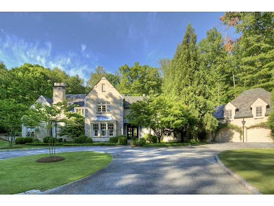
image via Beacham and Co. listing
This beautiful Keith Summerour designed Atlanta house is situated on 4 acres and was built in 2000. It was featured in House Beautiful in June 2012 and was renovated 3 years ago by Chad Mattison, the interiors are by Beth Webb. Jane Douglas and I were lucky to see the house in person a year ago. We had lunch and a lovely visit with the delightful owners, who took us on a tour of the house and told us about many of the pieces of furniture and art in the house. The interior design was a real collaboration between the owners and Beth Webb.
image via Beacham and Co. listing
image via Beacham and Co. listing
I received my copy of the Beacham Series in the mail over the weekend and noticed that the house is now for sale. The photos from the sale pictures are very different from those in House Beautiful and I thought it would be fun to see the spaces through the lenses of the two cameras. I also found photos of the house shot by photographer Emily Followill and have included some of those as well.
image via Beacham and Co. listing
Photos for shelter magazines are styled differently than photos for houses for sale - they are capturing different qualities of the house. For a shelter magazine the photographer is capturing the essence and feel of the house and its inherent beauty. When a house is photographed for listing purposes, the idea is to get a sense of the size and proportions of the rooms and to show off the unique features of the house that would make you want to own it.
The entrance hall from the Beacham and Co. listing
sitting room from the listing
above and below sitting room by Emily Followill
image via the Beacham and Co. listing
the beautiful living room via Beacham and Co. listing
Emily Followill
living room from House Beautiful, photo by William Abranowicz
another view of the living room from the Beacham and Co. listing
image via House Beautiful, photo by William Abranowicz
image via the Beacham and Co. listing
photo by Emily Followill
I love that in the above three photos, each photographer used a different chair at the end of the table. Three different eyes looking at the same space, three different visions.
image of the kitchen from the Beacham and Co listing
image from House Beautiful, photo by William Abranowicz
image from House Beautiful, photo by William Abranowicz
image via the listing
photo by Emily Followill
image via the listing - This room is simply stunning when you see it in person.
master bedroom here and below by Emily Followill
master bedroom via the listing
the dining area, photo by Emily Followill
dining area from House Beautiful, photo by William Abranowicz
master bath from House Beautiful, photo by William Abranowicz
master bath, photo by Emily Followill
master bath from the listing
patio from House Beautiful, photo by William Abranowicz
To see the complete listing click here.


Hi Helen, This home is so over-the-top gorgeous that I don't even know where to begin! Every room, enchanting. The china cabinet with those amazing doors is such a focal point....I just love the look of a painted cabinet with those elegantly curved stained doors and the shape of them, oh my gosh! Such a dream home. Thanks for the post!
ReplyDeleteHolly
Successfully portraying a room in photographs is much more difficult than many people realize. None of the photos are bad, but William Abranowicz is one of the country's top interior photographers currently and I think his shots evoke more of the feeling of the feeling of a room than many are able to capture. You are right that is very interesting to compare the work of three photographers; I appreciated the post.
ReplyDelete